Challenge
Feltman’s of Coney Island is a brand of hot dogs based in New York. They were doing great selling in grocery stores and at Coney Island as a food cart. However, they were struggling to build a national reputation and convert online sales as a result. They came to us to quickly find a scalable approach to increase sales on their e-commerce channel.
History of Feltman’s of Coney Island
Charles Feltman was the original creator of the hot dog on a bun. Yes, you read that correctly. He was a German immigrant who arrived in New York in 1856 at the age of fifteen. He is generally credited with inventing the hot dog on a bun. He began with a single pushcart and eventually became a restaurant mogul. But in 1954 finally closed their doors for good.
In 2015, two brothers from Brooklyn resurrected the Original Original hot dog on a bun and began selling the original frankfurter recipe under the Feltman’s of Coney Island brand moniker.
Solution
E-Commerce Solution & Marketing
Feltman’s was in need of an increase in online store conversions as well as a revitalization of their brand. During our initial discovery, we sent out a survey to their current customers to ask a few questions. What we discovered were customers who wanted to buy, but an online experience that was preventing that from happening efficiently. We identified gaps in the user journey and understood the small roadblocks users had when trying to purchase products online. Their online conversion rate consistently hovered around 0.56%. In the food and beverage industry, it wasn’t unheard of to see a 3%+ conversion rate and we needed to find out what was happening.
Journey Maps
The user flow, journey, and empathy maps were a great way to showcase the data that lead to our insights. The information gleaned from this exercise helped build 3 goals we sought to achieve during our rebuild of the e-commerce site. Those were:
Focus on navigation
Mobile-first experience
Make it easy to buy product
E-commerce website
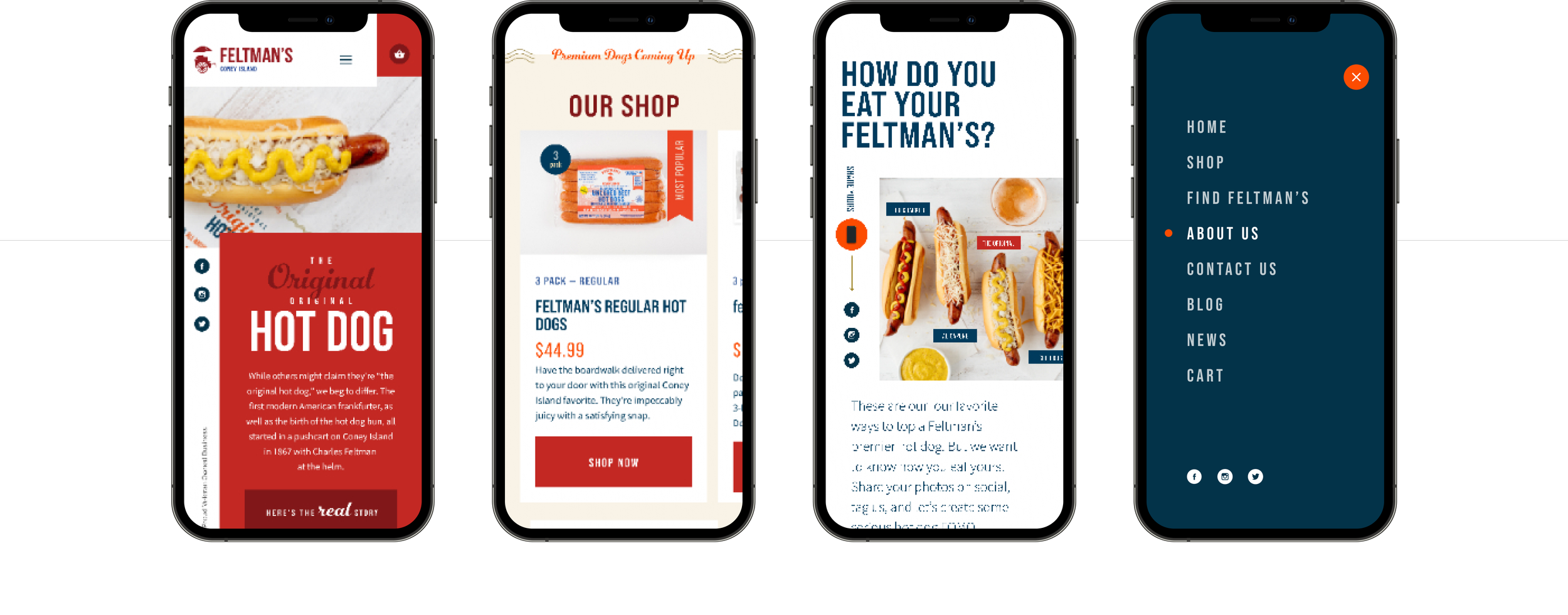
During our journey mapping process for the website, we found that over 80% of their consumers were using mobile. And the conversion rates were far lower than the desktop counterpart. After the update, we increased the mobile conversion rates from 0.34% to 2.76%. This allowed us to prove the hypothesis that the previous site was confusing to users and making it difficult to complete a purchase. Between the visual stimulus of delicious-looking hot dogs, optimizing for the customer journey, and dialing in the mobile experience it was a winning formula for the brand and the customers. As a result, their YOY sales increased 441% in a span of only 3 months and continues on the same track today.
Product selection and flow
They offered 3,6, and 9 packs of both skinless and traditional hot dogs and mustard as a single and 6 packs among other items. Previously it was difficult to know where to find, how to buy, and when the product would ship. We solved this by creating a product listing for each type and variant of hot dog, added clear photography of that specific product, and then in the name and description delineated all of these necessary details in a non-confusing manner. The add to cart button animated slightly and the shop icon updated as well to provide feedback to the user.


