Challenge
For patients who needed medical attention quickly, urgent care facilities provide fast and convenient access to a provider. However, the antiquated process of getting to an urgent care only to wait in line frustrated many would-be patients. And for the urgent cares themselves, they would lose nearly 15% of their business to these frustrated folks who would end up walking away. The problem was, “how might we allow future patients to reserve a spot, but not have to wait in long lines or crowded waiting rooms”?
Solution
Research
We quickly began by interviewing providers, clinic owners to help frame the problem. Next, we performed user interviews with approximately 30 different urgent care patients to get an idea of what problems they experienced and what it meant to try to find a solution. Many expressed, “it [waiting in line] was one of the most frustrating aspects of using an urgent care”. As we documented the interview process we began working on a customer journey and empathy map. This allowed us to better understand what gaps existed that weren’t as obvious by purely thinking about the problem ourselves.
Questions & Goals
As part of this discovery process, we identified 4 fundamental questions a solution should help to answer for the patient:
How quickly can they be seen by a provider?
Where is the nearest location?
Is it easy to reserve my spot?
Do they accept my insurance or what are the urgent care fees?
From the patient questions, we created a list of goals for our internal solution.
Clearly communicate when they can be seen
Use location services to provide clinics near the patient
Provide a quick and user-friendly way to get in line from home
Pre-fill paperwork, such as insurance to further reduce friction at the urgent care
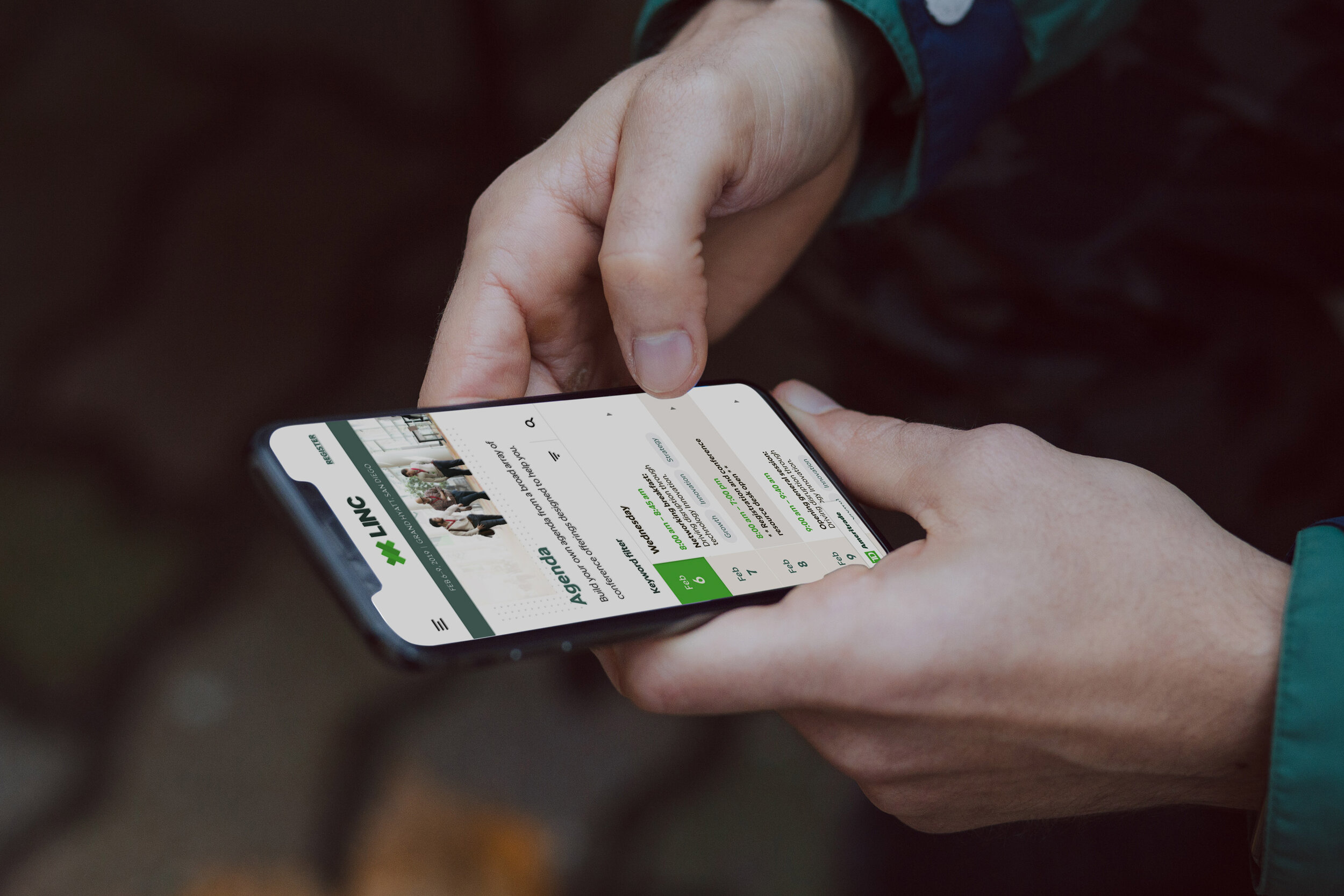
Because of the on-the-go nature of the clinic visitors, it became clear that a mobile-based online check-in product was best suited to help solve the problem. The users needed something that was already within the normal search flow, yet robust enough to quickly find details that may not be available through a basic Google search.
Search & Map Modes
Providing the user with control had two different modes. The first and primary was a location-based map mode. This allowed the user to view clinic locations near them and then most importantly helped them sort by other important criteria, such as wait time (1) and insurance acceptance type (4). Then we followed up a fast way to get in line that didn’t require first filling out the general paperwork prior. That was the next step.
The second mode allowed for those users who may have had a preference of a clinic or knew more precisely where they needed to go based upon criteria, such as if they have visited there prior and/or if they knew they accepted insurance.
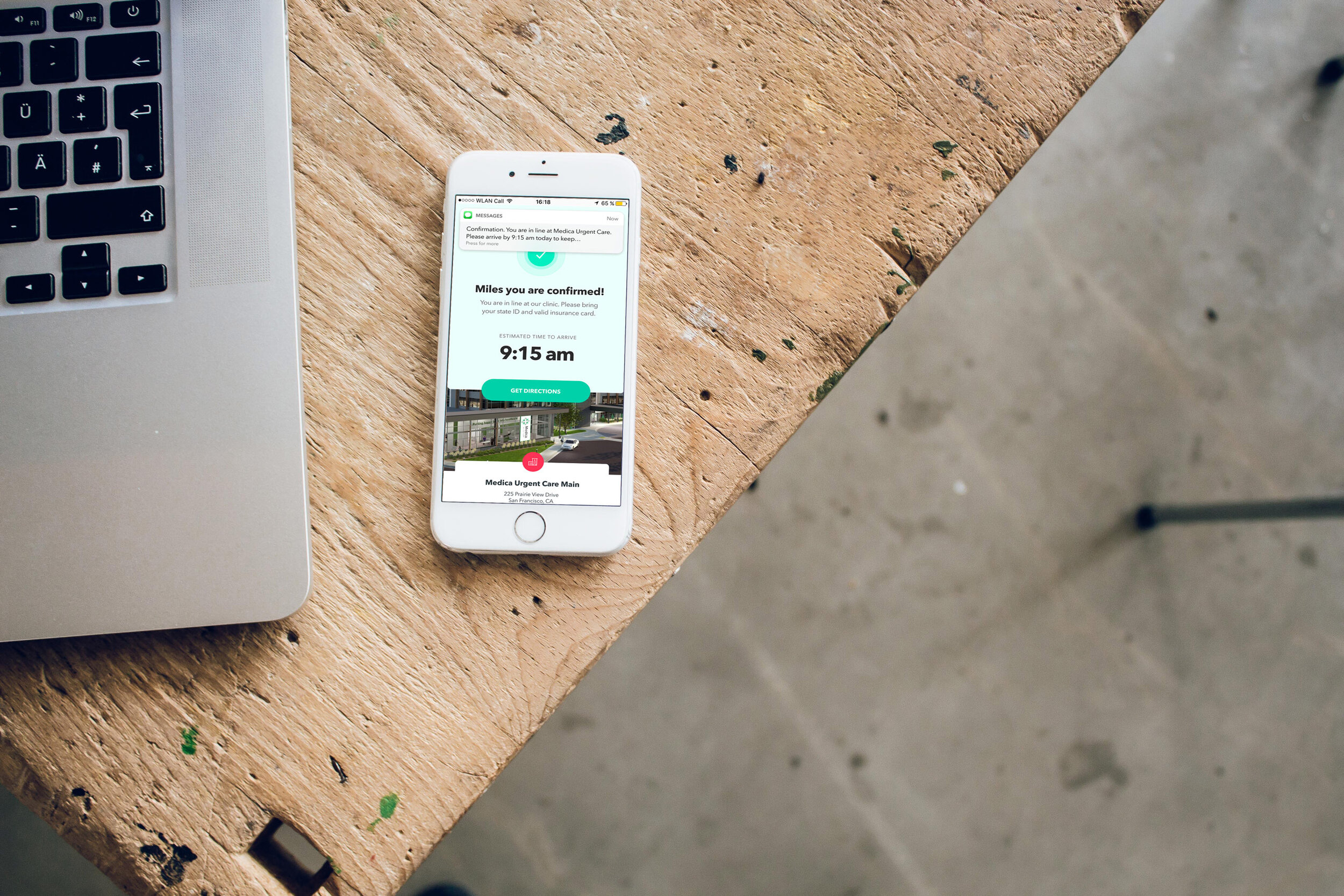
Registration & Confirmation
Once a user selects their preferred clinic, the app lets them know that their spot is now reserved for 10 minutes while they fill out the necessary patient visit information. The clear and overt visual communication of which urgent care, what time the patient would be seen, and confirmation of services offered built confidence for the user. One of the goals was fast online check-in for the patient. And one of the primary goals of the urgent care was the need to collect the patient’s information before they were to be seen. This reduced the wait time and decreased cost-inducing mistakes for the urgent care.
Lastly, we provided a clear confirmation page that provided details to the user and patient as to what time to arrive (not to be seen), directions, and details for the client. Additionally, a text message system was introduced to help drive communication and follow-up.
Patient Clinic Experience

Once the patient arrived they would check-in via the app and then be added to the patient queue. Generally, clinics are first-come-first-served and needed a way to accommodate both walk-in patients and online check-in patients. The waiting room was equipped with a TV screen that discreetly displayed the patient’s first name, last initial, and a code that was sent to their device via SMS. This helped with medical HIPAA compliance and informed the patient of their current status in the overall queue which reduced wait time stress.
Final thoughts
Historically, we focused on B2B with clinics, so this was one of our first forays into building a lightweight web-based application for consumers. There were many stakeholders who helped drive success on this and many aspects of this product. From maps to distribution to new technology there were many challenges we overcame during this. In the end, it was a highly needed product in the urgent care space for consumers as well as the clinics.
—
Work completed with Online Check-in was with DocuTAP.
Product Director: Darin Vander Well
Product Design & Brand Manager: Justin Henriksen
UX Research and UCD Analyst: Brianna Kryaanbrink-Nelsen
Development: DocuTAP internal
A few other Portfolio Projects